
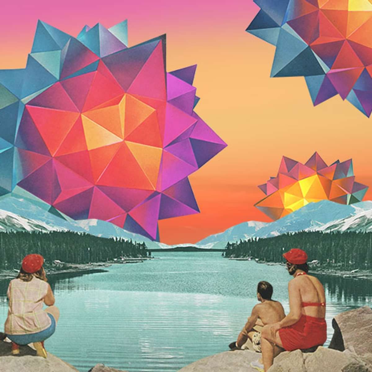

What's the idea behind the 'After the Landslide' cover?
Matt and I discussed the theme of “starting over” and how this was a common theme in many of the songs on the album. It might be a break-up, a career change or moving cities. It can be both a positive, uplifting experience but extremely terrifying at the same time. We wanted to keep with the vintage quality of my other works, together with a psychedelic, surreal feel. The vibe we were going for was surreal yet overwhelmingly optimistic.

Much of your work can be described as 'retro' from the 50's/60's. What are you attracted to this era in particular?
I collect vintage magazines and books, from 1930s through to the 1970s. The quality and the colour palettes of the images, especially the Kodachrome and Ektachrome photography, is far more appealing to me than modern digital imagery. I also like the idea of reusing old images that have been forgotten and juxtaposing them with other combinations to make retro-futuristic surreal landscapes which can be appreciated by a modern audience.
Your collages contains a common theme which are all quite unrelated - planets, cacti, flowers, cars, deserts, bodies of water, pools. Do these subjects represent any particular significance?
I’m a material driven artist so it’s really the images I find, often randomly, which I use in my work. I might be attracted to the architectural line of a building, the colour of a sunset or the beauty of a close up of a cactus flower. I do live by the beach in Australia, and in a past life worked as a horticulturalist, so sometimes this comes through in my work.

What are the processes involved when creating your art, specifically the After the landslide cover? Feel free to get a little technical If you wish.
It was a matter of understanding Matt’s vision and what he saw in my work which could bring that vision to life. He sent me thumbnails of his favourite pieces of mine, with elements he’d like to include on the cover, such as desert imagery and surreal flowers. My method is really to collect images, both on paper and digital, and seeing which combinations work, and creating layered digital files. Then it was really a matter of feedback and discussions with Matt, changing drafts, adding or detracting elements. We went through many variations, different people, different skies, resizing elements, to reach the final version.

Can you identify any particular synergies between Matt's work and yours
I feel like Matt and my work have a positive, optimistic vibe.

Please briefly talk us though us through each individual piece in the series - We Can Do Better, Made It out Alright, Open Up, Amy's Song, Dust, and of course the Album
Most of the artwork for the singles was based on existing pieces from my portfolio that appealed to Matt. These were then modified to suit the cover art format. We tried to keep a consistent vintage quality throughout.

What inspires you in general?
I’m inspired by vintage photography, Surrealism and Expressionism, retro films, architecture, graphic design and above all, the colours and beauty of nature.
